
Hw1
Exploring NOAA Climate Data
Creating a Database
- I first began by importing pandas, matplotlib.pyplot, and sqlite3
import pandas as pd import matplotlib.pyplot as plt from plotly import express as px import sqlite3 - Using ‘pd.read_csv’ I read the data from temperatures, countries, and stations intro my notebook and assigned each csv to a variable
temps = pd.read_csv("temps_stacked.csv") countries = pd.read_csv('countries.csv') stations = pd.read_csv('station-metadata.csv') - I removed the white spaces in the countries’ data country codes columns
countries = countries.rename(columns= {"FIPS 10-4": "FIPS_10-4"}) - I opened a connection to the temps database so that I could ‘talk’ to it using python
conn = sqlite3.connect("temps.db")
temps.to_sql("temperatures", conn, if_exists="replace", index=False)
countries.to_sql("countries", conn, if_exists="replace", index=False)
stations.to_sql("stations", conn, if_exists="replace", index=False)

conn.close()
- It is important to close a connection after you have opened it
Creating a Query Function
- I defined my function with 4 inputs
- I opened a connection and utilized SQL to create the query
- I used the pandas read sql function to read the SQL query into a dataframe
- Close the connection
def query_climate_database(country, year_begin, year_end, month):

    conn = sqlite3.connect("temps.db")
    cmd = \
    f"""
    SELECT SUBSTRING(S.id,1,2) country, S.name,  S.latitude, S.longitude, T.temp, T.year, T.month
    FROM temperatures T
    LEFT JOIN stations S ON T.id = S.id
    WHERE (year>={str(year_begin)} AND year<={str(year_end)}) AND (month={month}) AND (country=upper(SUBSTRING('{country}',1,2)))
    """

    df = pd.read_sql_query(cmd, conn)
    conn.close()
    return df
query_climate_database(country = "india",
                       year_begin = 1980,
                      year_end = 2020,
                      month = 1)
A geographic scatter function for yearly temperature increases
- Import plotly express and import LinearRegression from sklearn.linear_model
- Create a function that computes the coefficient of a linear regression model tHat will be used on stations, this will reflect yearly changes in temperature during the specified time
def coef(df):

    X = df["Year"].values.reshape(-1,1) #x is time, two brackets bbecause linear regression expects this x to be a data frame.
    #one set of ackets is a series
    y = df["Temp"] #y should be a series for temp, so use one bracket
    LR = LinearRegression() #class
    LR.fit(X, y) #fit a line thru the class
    slope = LR.coef_[0]
    return slope
- Create a function called temperature_coefficient_plot that takes in 5 inputs
- Inside this function, create the sql query like the one made in the previoys problem
- I then groupby station name, month, longitude, and latitude apply my coefficient function to these columns
- Next I set up the scatter mapbox with the necessary attributes
def temperature_coefficient_plot(country, year_begin, year_end, month, min_obs, **kwargs):

    conn = sqlite3.connect("temps.db")
    cmd = \
    f"""
    SELECT SUBSTRING(S.id,1,2) country, S.name,  S.latitude, S.longitude, T.temp, T.year, T.month
    FROM temperatures T
    LEFT JOIN stations S ON T.id = S.id
    WHERE (year>={str(year_begin)} AND year<={str(year_end)}) AND (month={month}) AND (country=upper(SUBSTRING('{country}',1,2)))
    """

    df = pd.read_sql_query(cmd, conn)
    conn.close()

    coefs = df.groupby(["NAME", "Month", "LATITUDE", "LONGITUDE"]).apply(coef)
    coefs = coefs.reset_index()
    coefs.rename(columns={0:"Estimated yearly increase in temp "},inplace = True) #inplace minimizes redefining

    fig = px.scatter_mapbox(coefs, # data for the points you want to plot
                        lat = "LATITUDE", # column name for latitude informataion
                        lon = "LONGITUDE", # column name for longitude information
                        hover_name = "NAME", # what's the bold text that appears when you hover over
                        zoom = 1, # how much you want to zoom into the map
                        height = 300,
                        mapbox_style="carto-positron", # map style
                        color = "Estimated yearly increase in temp ", #slope
                        opacity=0.2) # Opacity of each data point


    fig.update_layout(margin={"r":0,"t":0,"l":0,"b":0}) #reduce wehite space
    fig.show()
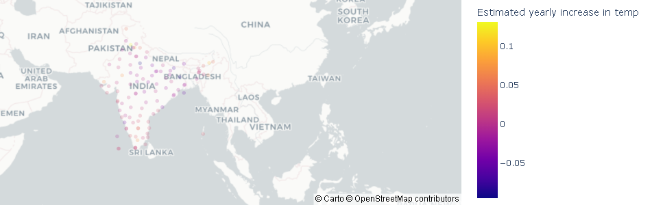
color_map = px.colors.diverging.RdGy_r # choose a colormap

fig = temperature_coefficient_plot("India", 1980, 2020, 1,
                                  min_obs = 10,
                                  zoom = 2,
                                  mapbox_style="carto-positron",
                                  color_continuous_scale=color_map)

fig
Show me the data for temperatures of a specified country Within a given range of latitudes for a specified month
- Set up a function
- Open SQL
- Inside WHERE specify that the latitude needs to be in the range the user inputs
- Inside WHERE, the month is what the user inputs
- Inside WHERE, the country is what the user inputs. Utilize substring to take the first two letters of the users input in order to match it to the countries data. Make it not case sensitive.
def query_latitude(country, latitude_begin, latitude_end, month):

    conn = sqlite3.connect("temps.db")
    cmd = \
    f"""
    SELECT SUBSTRING(S.id,1,2) country, S.name,  S.latitude, S.longitude, T.temp, T.year, T.month
    FROM temperatures T
    LEFT JOIN stations S ON T.id = S.id
    WHERE (latitude>={str(latitude_begin)} AND latitude<={str(latitude_end)}) AND (month={month}) AND (country=upper(SUBSTRING('{country}',1,2)))
    """

    df = pd.read_sql_query(cmd, conn)
    conn.close()
    return df
query_latitude(country = "India",
               latitude_begin =20,
               latitude_end= 50,
               month = 1)
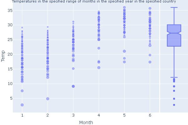
What does temperature look like over a range of spefied months for a spefic cOuntry in a certain year?
- Create a function
- Open SQL and create the dataframe based on the inputs
- Create a scatter plot with x as month and y as temp
- Add necessary attributes to the plot
def country_temp(country, month_begin, month_end, year):

 conn = sqlite3.connect("temps.db")
 cmd = \
 f"""
 SELECT SUBSTRING(S.id,1,2) country, S.name,  S.latitude, S.longitude, T.temp, T.year, T.month
 FROM temperatures T
 LEFT JOIN stations S ON T.id = S.id
 WHERE (month>={str(month_begin)} AND month<={str(month_end)}) AND (year={year}) AND (country=upper(SUBSTRING('{country}',1,2)))
 """

 df = pd.read_sql_query(cmd, conn)
 conn.close()

 fig = px.scatter(data_frame = df, # data that needs to be plotted
              x = "Month", # column name for x-axis
              y = "Temp", # column name for y-axis
              size = "LATITUDE", # column name for size of points
              size_max = 8,
              opacity = 0.5,
              hover_name = "country",
              width = 600,
              height = 400,
             marginal_y = "box",)

 fig.update_layout(
     title={
         'text':"Temperatures in the specified range of months in the specified year in the specified country",
         'y':1,
         'x':0.5,
         'xanchor':'center',
         'yanchor':'top'
     })

 fig.update_layout(title_font_size=11)

 fig.update_layout(margin={"r":0,"t":0,"l":0,"b":0})
 fig.show()
country_temp(country="India",
         month_begin=1,
         month_end=6,
         year=2000)
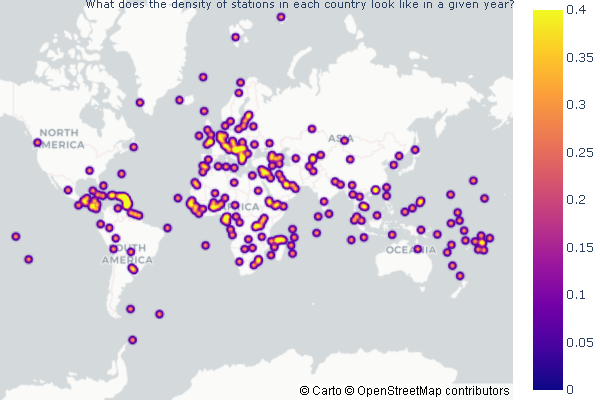
What does the density of stations look like across the globe in a given set of years? I also want to see how many stations were in a country at this time.
- Create a function
- Open SQL to create the dataframe
- Get a count of the stations in each country for specified time
- Create the density mapblox of this dataframe and add the necessary attributes
- Make it so that when you hover over a point in a country you can see how many stations were in thaat country
def dens_of_stations(year_begin, year_end):

    conn = sqlite3.connect("temps.db")
    cmd = \
    f"""
    SELECT SUBSTRING(S.id,1,2) country, count(S.name),  S.latitude, S.longitude, T.temp, T.year
    FROM temperatures T
    LEFT JOIN stations S ON T.id = S.id
    WHERE (year>={str(year_begin)} AND year<={str(year_end)})
    GROUP BY country
    """

    df = pd.read_sql_query(cmd, conn)
    conn.close()

    fig = px.density_mapbox(df, # data for the points you want to plot
                            lat = "LATITUDE", # column name for latitude informataion
                            lon = "LONGITUDE", # column name for longitude information
                            height = 400, # control aspect ratio
                            width = 600,
                            mapbox_style="carto-positron", # map style
                            hover_name = "country",
                            hover_data=["count(S.name)"],
                            range_color=[0, 0.4],
                            title = "The density of stations across the globe in a given range of years",
                            zoom=0,
                            radius= 5
                            )

    fig.update_layout(
        title={
            'text':"What does the density of stations in each country look like in a given year?",
            'y':1,
            'x':0.5,
            'xanchor':'center',
            'yanchor':'top'
        })

    fig.update_layout(title_font_size=11)


    fig.update_layout(margin={"r":0,"t":0,"l":0,"b":0})
    fig.show()
dens_of_stations(1900, 2020)
Written on April 16, 2022