
How to Make a Histogram with Plotly Express
In this post, we will learn how to create a histogram using plotly express
Libraries and Modules
To start, import pandas and plotly express
import pandas as pd
import plotly.express as px
Data
Read in your data using the pandas function, read_csv
url = "https://raw.githubusercontent.com/PhilChodrow/PIC16B/master/datasets/palmer_penguins.csv"
penguins = pd.read_csv(url)
Plot Arguments
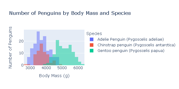
- Specify what your x axis will be. In this case, the x-axis is the body masses of the penguins.
- Assign the color to be a column of the dataset, in this case it is species. The different categories of species will be depicted by the color of the histogram bars.
- Use the height and width arguments to specify the height and width of your plot.
- The barmode argument specifies how you would like the bars to be depicted with one another. For example, they could be grouped and represented side by side or they could be overlayed. Being that some penguins of different species might have the same body mass, overlay is probably the best choice in this case.
- One more thing to note is that the default argument of the y-axis is “count”, but this is not very specific. We want the title to be more indicative of what the graph is showing. Use update_layount to change the title of the y-axis.
There are many other arguments you can use to customize your graphs, which can be found here: https://plotly.github.io/plotly.py-docs/generated/plotly.express.histogram.html
fig = px.histogram(penguins,
                   x = "Body Mass (g)", #the body mass data will be used for the x-axis
                   title = "Number of Penguins by Body Mass and Species",
                   color = "Species", #species will be depicted by the color of the bars
                   barmode='overlay',
                   width = 600,
                   height = 300
                   )

fig.update_layout(yaxis_title = "Number of Penguins") #change the title of the y-axis from "count" to this

fig.show() # show the plot
Written on April 8, 2022