Scotus opinion project

Overview

For our project, we conducted a sentiment analysis on the opinions of Supreme Court Justices with the aim to differentiate and highlight the unique “legal writing styles” of the Justices, which is beneficial for people learning about legal writing and may reveal Justices’ legal philosophy. Our methodology included downloading large volumes of Supreme Court opinion PDFs from the official website. Then, we used OCR tools to detect and store the text before using regular expressions to separate the opinions and identify the author in order to construct our official dataset CSV. After preparing the data, we utilized NLP packages and tensorflow in order to find high prevalence words for each opinion type and author, as well as score the overall sentiment in the opinion. Once we created our models for both type and author classification based on the text, we tested these models on completely unseen data from the past 2 months. After examining our results, which were poor on the unseen data, we attempted to recreate our models after removing the justices from the training set who were not seen in the test set. As a result, our results seemed to improve. overviewpic.png

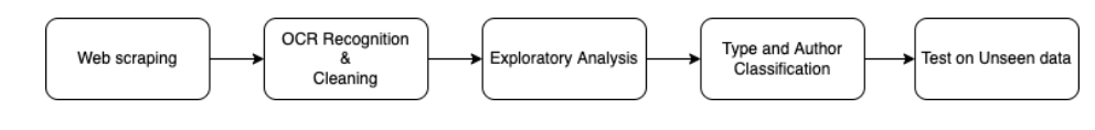
Technical Components

Web Scraping OCR/Text Cleaning Type and Author Classification Retraining the Data and repeating Testing

Web Scraping

We began by scraping the Supreme Court Opinions Directory which contained pdf links of the Supreme Court opinions from 2021 to 2014. To create the scraper, we made a parse method that used the relevant css selectors and tags to acquire the opinion PDF links for each month of the year. Next we utilized a for loop to index through the list of PDF links and download the PDFs. A second parse method was created to go to the website links of each year and scrape and continue this process of downloading the PDFs.

webscrappic.png

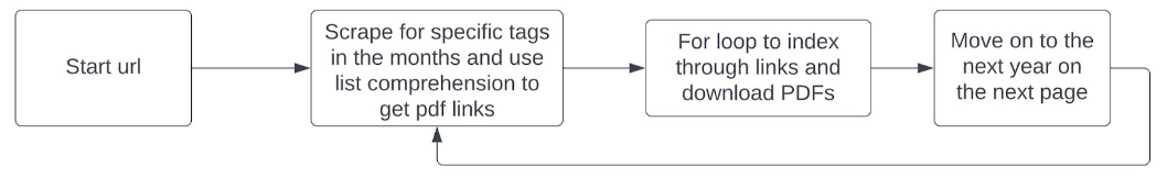
In the settings file, we specified “pdf” to be the document format to save the files as. A download delay was also implemented. Without this, multiple threads will try to write to the csv file at the same time. This will produce a file lock error in the command prompt and no downloads.

import scrapy
from pic16bproject.items import Pic16BprojectItem

class courtscraper(scrapy.Spider):
    name = 'court_spider'
    
    start_urls = ['https://www.supremecourt.gov/opinions/slipopinion/20']

    def parse_start_url(self, response):
        
        return self.parse(response)

    def parse(self, response):
        
        cases = response.css("td a")
        pdfs = [a.attrib["href"] for a in cases] 
        prefix = "https://www.supremecourt.gov"
        pdfs_urls = [prefix + suffix for suffix in pdfs]

    
        for url in pdfs_urls:
            item = Pic16BprojectItem() #define it items.py
            item['file_urls'] = [url]
            yield item

    def next_parse(self, response):
        next_page = response.css('div.col-md-12 a::attr(href)').extract() #do i need [0]^M
        yield scrapy.Request(next_page, callback=self.next_parse)

OCR and Text Cleaning

After downloading the opinion PDFs from the website using the scrapy spider, we will do the following:

  • For each opinion, convert pages into jpg files
  • Use OCR package to recognize the letters in the images and turn them into paragraphs of text
  • There is a significant chunk of regular expression in the middle that cleans the text, gets rid of filler headers, syllabus pages, appendix etc
  • Finally check if the resulting text fits a certain format. If it does, append the opinion info (Author, Text, Opinion Type) into the designated pandas data frame (which we will use for the remainder of the project). If the format does not match (special reports), we omit them.
  • If the conversion is successful, the PDF will be automatically deleted. If te latter case, a message will be shown and the user can manually check out both the raw PDF and the converted txt file.
For every opinion PDF (downloaded from spider)
for op in [i for i in os.listdir("./opinion_PDFs") if i[-3:] == 'pdf']:
    
    # *** Part 1 ***
    pages = convert_from_path("./opinion_PDFs/" + op, dpi = 300)
    image_counter = 1
    # Iterate through all the pages in this opinion and store as jpg
    for page in pages:
        # Declaring filename for each page of PDF as JPG
        # For each page, filename will be:
        # PDF page 1 -> page_1.jpg
        # ....
        # PDF page n -> page_n.jpg
        filename = "page_"+str(image_counter)+".jpg"
        # Save the image of the page in system
        page.save(filename, 'JPEG')
        # Increment the counter to update filename
        image_counter = image_counter + 1
    image_counter = image_counter - 1
    
    # *** Part 2 ***
    # Creating a text file to write the output
    outfile = "./opinion_txt/" + op.split(".")[0] + "_OCR.txt"
    # Open the file in append mode
    f = open(outfile, "w")

    # Iterate from 1 to total number of pages
    skipped_pages = []
    print("Starting OCR for " + re.findall('([0-9a-z-]+)_', op)[0])
    print("Reading page:")
    for i in range(1, image_counter + 1):
        print(str(i) + "...") if i==1 or i%10==0 or i==image_counter else None
        # Set filename to recognize text from
        filename = "page_" + str(i) + ".jpg"
        # Recognize the text as string in image using pytesserct
        text = pytesseract.image_to_string(Image.open(filename))
        # If the page is a syllabus page or not an opinion page
        # marked by "Opinion of the Court" or "Last_Name, J. dissenting/concurring"
        # skip and remove this file; no need to append text
        is_syllabus = re.search('Syllabus\n', text) is not None
        is_maj_op = re.search('Opinion of [A-Za-z., ]+\n', text) is not None
        is_dissent_concur_op = re.search('[A-Z]+, (C. )?J., (concurring|dissenting)?( in judgment)?', text) is not None
        if is_syllabus or ((not is_maj_op) and (not is_dissent_concur_op)):
            # note down the page was skipped, remove image, and move on to next page
            skipped_pages.append(i)
            os.remove(filename)
            continue
        # Restore sentences

        # Restore sentences
        text = text.replace('-\n', '')
        # Roman numerals header
        text = re.sub('[\n]+[A-Za-z]{1,4}\n', '', text)
        # Remove headers
        text = re.sub("[\n]+SUPREME COURT OF THE UNITED STATES[\nA-Za-z0-9!'#%&()*+,-.\/\[\]:;<=>?@^_{|}~—’ ]+\[[A-Z][a-z]+ [0-9]+, [0-9]+\][\n]+",
                  ' ', text)
        text = re.sub('[^\n]((CHIEF )?JUSTICE ([A-Z]+)[-A-Za-z0-9 ,—\n]+)\.[* ]?[\n]{2}',
                  '!OP START!\\3!!!\\1!!!', text)
        text = re.sub('[\n]+', ' ', text) # Get rid of new lines and paragraphs
        text = re.sub('NOTICE: This opinion is subject to formal revision before publication in the preliminary print of the United States Reports. Readers are requested to noti[f]?y the Reporter of Decisions, Supreme Court of the United States, Washington, D.[ ]?C. [0-9]{5}, of any typographical or other formal errors, in order that corrections may be made before the preliminary print goes to press[\.]?',
                      '', text)
        text = re.sub('Cite as: [0-9]+[ ]?U.S.[_]* \([0-9]+\) ([0-9a-z ]+)?(Opinion of the Court )?([A-Z]+,( C.)? J., [a-z]+[ ]?)?',
                      '', text)
        text = re.sub(' JUSTICE [A-Z]+ took no part in the consideration or decision of this case[\.]?', '', text)
        text = re.sub('[0-9]+ [A-Z!&\'(),-.:; ]+ v. [A-Z!&\'(),-.:; ]+ (Opinion of the Court )?(dissenting[ ]?|concurring[ ]?)?',
                  '', text)
        # Remove * boundaries
        text = re.sub('([*][ ]?)+', '', text)
        # Eliminate "It is so ordered" after every majority opinion
        text = re.sub(' It is so ordered\. ', '', text)
        # Eliminate opinion header
        text = re.sub('Opinion of [A-Z]+, [C. ]?J[\.]?', '', text)
        # Separate opinions
        text = re.sub('!OP START!', '\n', text)
    
        # Write to text
        f.write(text)
    
        # After everything is done for the page, remove the page image
        os.remove(filename)
    # Close connection to .txt file after finishing writing
    f.close()
    
    # Now read in the newly created txt file as a pandas data frame if possible
    
    try:
        op_df = pd.read_csv("./opinion_txt/" + op.split(".")[0] + "_OCR.txt",
                            sep = re.escape("!!!"), engine = "python",
                            names = ["Author", "Header", "Text"])
        op_df.insert(1, "Docket_Number", re.findall("([-a-z0-9 ]+)_", op)[0])
        op_df["Type"] = op_df.Header.apply(opinion_classifier)
        
        # Lastly add all the opinion info to the main data frame
        opinion_df = opinion_df.append(op_df, ignore_index = True)
        os.remove("./opinion_PDFs/" + op)

        print("Task completed\nPages skipped: " + str(skipped_pages) + "\n")
    except:
        print("Error in CSV conversion. Pages NOT added!\n")
        
print("-----------------------\nAll assigned OCR Completed")

Type and Author Classification

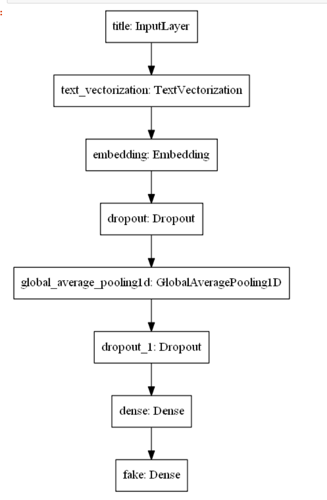
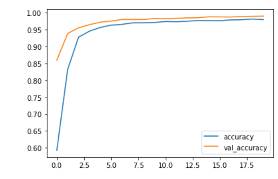
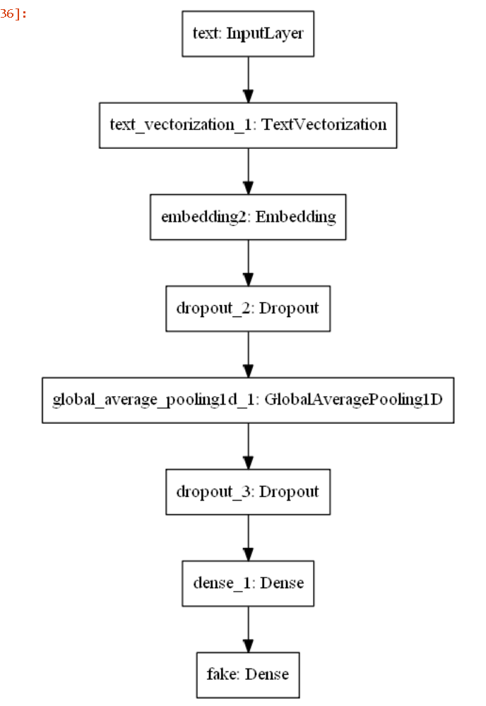
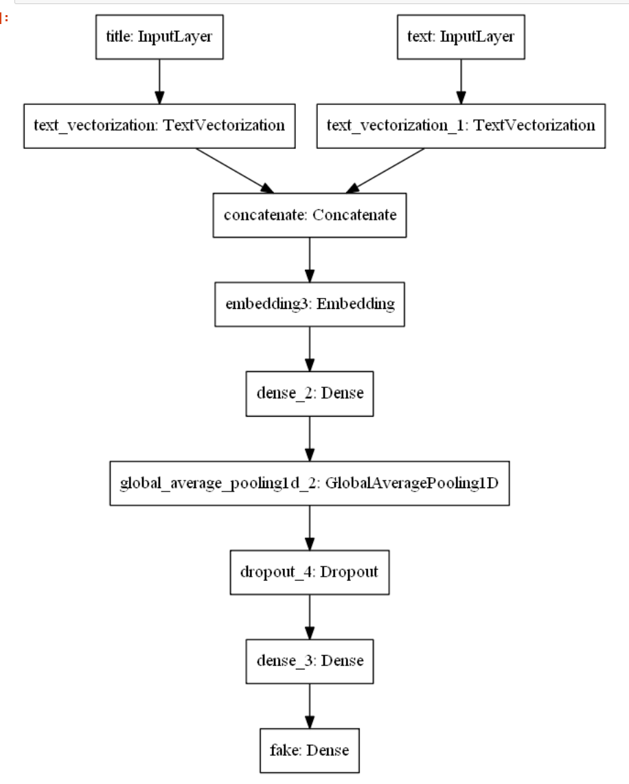
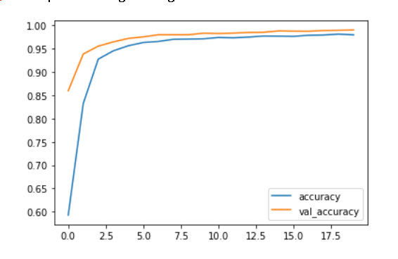
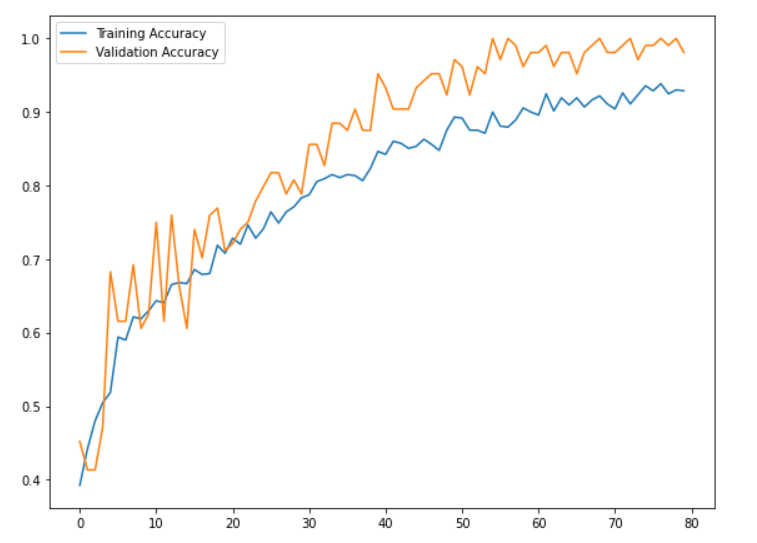
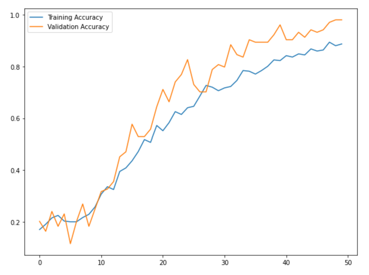
We used tensorflow in order to classify all of the opinion types and justices, labeled as authors, based on the text alone. To do this, we created two data frames: one with type and text as the columns, and another with author and text as the columns. Then, we converted each type and column into integer labels using a label encoder in order to move forward with our classification task. We split our data into 70% training, 10% validation, and 20% testing in order to train our models and compare our resulting accuracies,. Both the type and author models implemented a sequential model that used an embedding layer, two dropout layers, a 1D global average pooling layer, and a dense layer. The dimensions for the output and dense layer were altered based on the total number of opinion types (4) and total number of authors (12). We experienced great success with the training and validation accuracies for both models. For the type model, the training accuracies hovered around 92% and the validation accuracies settled around 99% as the later epochs were completed. For the author model, the training accuracies hovered around 87% and the validation accuracies settled around 97% as the later epochs were completed. Further, we did not worry too much about overfitting as there was a large amount of overlap between training and validation accuracies and there was never too much of a dropoff between the two. After training our models, we evaluated them on the testing set which was the random 20% of the original data. Once again, experienced great success as the type and author test accuracies were ~99.5% and ~95.6%, respectively. Thus, our models performed very well on the original dataset. However, we also created an additional testing set that included unseen data from the past two months alone. This is where our models seemed to falter. pecifically, our type model testing accuracy was ~28.1% and our author model testing accuracy was ~3.1%. These are clearly much lower than the testing accuracies from our initial data. Thus, we performed further evaluation of our datasets and noticed some variations. Specifically, the unseen test set which has all the data from the last two months, consisted of fewer authors than our original data. So, we removed the justices from the original dataset who were not seen in the data from the last two months and retrained and tested our models once again. Similar to the first time, the training and validation accuracies were very high. However, we did notice a slight increase in our testing accuracies as the type model improved to ~34.4% and our author model improved to ~15.6%. Although these are still rather low, we believe that further inspection into our test dataset would provide us with more clarity about potential improvements that we could make to our model so that it performs better with the testing data.

le = LabelEncoder()
train_lmt["Type"] = le.fit_transform(train_lmt["Type"])

type_df = train_lmt.drop(["Author"], axis = 1)
type_df

type_train_df = tf.data.Dataset.from_tensor_slices((train_lmt["Text"], train_lmt["Type"]))

type_train_df = type_train_df.shuffle(buffer_size = len(type_train_df))

# Split data into 70% train, 10% validation, 20% test
train_size = int(0.7*len(type_train_df)) 
val_size = int(0.1*len(type_train_df))

type_train = type_train_df.take(train_size) 
type_val = type_train_df.skip(train_size).take(val_size)
type_test = type_train_df.skip(train_size + val_size)

opinion_type = type_train.map(lambda x, y: x)
vectorize_layer.adapt(opinion_type)

train_vec = type_train.map(vectorize_pred)
val_vec = type_val.map(vectorize_pred)
test_vec = type_test.map(vectorize_pred)

type_model.compile(loss = losses.SparseCategoricalCrossentropy(from_logits = True),
                   optimizer = "adam", 
                   metrics = ["accuracy"])

type_model.summary()

trainplot1.png trainplot2.png

Concluding Remarks

I am very satisfied with the outcome of our project. This project helped me understand a lot more about web scraping in particular. This was my first time conducting a sentiment analysis and it was interesting to see all the steps we needed to take in order to achieve a sentiment analysis. With more time, we would look into why the model performed better with the 20% test data set from the main data frame but performed significantly less accurately than the true test data.

Read More

Hw4

Fake News?

In this blog post, I will develop and asses a fake news classifier

Imports

import nltk
import numpy as np
import pandas as pd
import tensorflow as tf
import re
import string
from tensorflow.keras import layers
from tensorflow.keras import losses
from tensorflow import keras
from tensorflow.keras.layers.experimental.preprocessing import TextVectorization
from tensorflow.keras.layers.experimental.preprocessing import StringLookup
from tensorflow.keras import utils
from sklearn.model_selection import train_test_split
from sklearn.preprocessing import LabelEncoder
import plotly.express as px 
import plotly.io as pio
pio.templates.default = "plotly_white"

Read in the data

train_url = "https://github.com/PhilChodrow/PIC16b/blob/master/datasets/fake_news_train.csv?raw=true"
df = pd.read_csv(train_url)
mydata=df

Making a data set

After reading in the data, I created a function that removes stop words (as, the, of, etc.) using nltk.corpus. The function also returns a dataset with title and text of an article as the inputs and fake as the output.

from nltk.corpus import stopwords
stop = stopwords.words('english')
def make_dataset(inpdata):

    inpdata["title"] = inpdata["title"].apply(lambda x: ' '.join([word for word in x.split() if word not in (stop)])) #removing stop words from titles
    inpdata['text'] = inpdata['text'].apply(lambda x: ' '.join([word for word in x.split() if word not in (stop)])) #removing stop words from the texts
    
    data = tf.data.Dataset.from_tensor_slices(
        ( # dictionary for input data/features
            { "title": inpdata[["title"]],
             "text": inpdata[["text"]]
            },
            # dictionary for output data/labels
            { "fake": inpdata["fake"] #single brackets will return one column, two brackets will return a full df
            }   
        ) 
    )
    return data.batch(100) #batch the dataset

Train and Validation

Then I split 20% of the dataset I made to use for validation.

mydata = make_dataset(mydata)

mydata = mydata.shuffle(buffer_size = len(mydata))

train_size = int(0.8*len(mydata)) #80% train
val_size   = int(0.2*len(mydata)) #20% validation

train = mydata.take(train_size)
val = mydata.skip(train_size).take(val_size)

Base Rate

In order to determine the base rate, I start by creating an iterator to evaluate the labels on the training data

labels_iterator= train.unbatch().map(lambda dict_title_text, label: label).as_numpy_iterator()

Then I create two integers. Depending on the value in the label, fake, one of these integer variables will increase. This keeps track of how many fake and real articles there are. This will be used to determine the accuracy of the model (the base rate).

first_num = 0 #create an int
sec_num = 0 #create an int
for i in labels_iterator:
    if i["fake"]==0: #if its not fake, increase the value of the first int
        first_num+=1 
    else: #if its fake, increase the value of the second int
        sec_num+=1

The base rate is approximately 10%. If every news was identified as fake, it would be about 10% accurate.

Text Vectorization

#preparing a text vectorization layer for tf model
size_vocabulary = 2000

def standardization(input_data):
    lowercase = tf.strings.lower(input_data)
    no_punctuation = tf.strings.regex_replace(lowercase,
                                  '[%s]' % re.escape(string.punctuation),'')
    return no_punctuation 

title_vectorize_layer = TextVectorization(
    standardize=standardization,
    max_tokens=size_vocabulary, # only consider this many words
    output_mode='int',
    output_sequence_length=500) 

title_vectorize_layer.adapt(train.map(lambda x, y: x["title"]))

First Model - Using article titles to detect fake news

To start my first model, I defined the inputs. This model will just take the article title as input.

# inputs
titles_input = keras.Input(
    shape = (1,), 
    name = "title",
    dtype = "string"
)

Next, I created the layers needed for processing the titles

titles_features = title_vectorize_layer(titles_input)
## Add embedding layer , dropout ...

titles_features = title_vectorize_layer(titles_input) # apply this "function TextVectorization layer" to lyrics_input
titles_features = layers.Embedding(size_vocabulary, output_dim = 2, name = "embedding")(titles_features) #need to give name embedding to reference layer
titles_features = layers.Dropout(0.2)(titles_features)
titles_features = layers.GlobalAveragePooling1D()(titles_features)
titles_features = layers.Dropout(0.2)(titles_features)
titles_features = layers.Dense(32, activation='relu')(titles_features)

I created an output layer

output = layers.Dense(2, name = "fake")(titles_features) 

Defined the model

model1 = keras.Model(
    inputs = titles_input,
    outputs = output
) 

Visualized the model

keras.utils.plot_model(model1)

model1plot.png

Compile the model

model1.compile(optimizer="adam",
              loss = losses.SparseCategoricalCrossentropy(from_logits=True),
              metrics=["accuracy"])

Fit the model

history = model1.fit(train, 
                    validation_data=val,
                    epochs = 20, 
                    verbose = False)

Create a plot to visualize the model’s accuracy

from matplotlib import pyplot as plt
plt.plot(history.history["accuracy"])
plt.plot(history.history["val_accuracy"])

model1pyplot.png

Model 2 - Using article text to detect fake news

I followed the same steps as the first model, but I examine titles instead of text

Text Vectorization

text_vectorize_layer = TextVectorization(
    standardize=standardization,
    max_tokens=size_vocabulary, # only consider this many words
    output_mode='int',
    output_sequence_length=500) 

text_vectorize_layer.adapt(train.map(lambda x, y: x["text"]))

Inputs

text_input = keras.Input(
    shape = (1,), 
    name = "text",
    dtype = "string"
)

Layers for processing the texts

text_features = text_vectorize_layer(text_input)
## Add embedding layer , dropout ...

text_features = text_vectorize_layer(text_input) # apply this "function TextVectorization layer" to text_input
text_features = layers.Embedding(size_vocabulary, output_dim = 2, name = "embedding2")(text_features) #naming it embedding 2 prevents errors
text_features = layers.Dropout(0.2)(text_features)
text_features = layers.GlobalAveragePooling1D()(text_features)
text_features = layers.Dropout(0.2)(text_features)
text_features = layers.Dense(32, activation='relu')(text_features)

Output layer

output = layers.Dense(2, name = "fake")(text_features) 

Create the model

model2 = keras.Model(
    inputs = text_input,
    outputs = output
) 

Visualize the model

keras.utils.plot_model(model2)

model2plot.png

Compile the model

model2.compile(optimizer="adam",
              loss = losses.SparseCategoricalCrossentropy(from_logits=True),
              metrics=["accuracy"])

Fit the model

history = model2.fit(train, 
                    validation_data=val,
                    epochs = 20, 
                    verbose = False)

Create a plot of the model’s accuracy

from matplotlib import pyplot as plt
plt.plot(history.history["accuracy"])
plt.plot(history.history["val_accuracy"])

model2pyplot.png

Model 3 - Using article titles and text to detect fake news

In this model, both titles and texts will be used to detect fake news.

titles_features = title_vectorize_layer(titles_input) #to use for first main
text_features = text_vectorize_layer(text_input) #to use for first main
#using the two lines above will prevent a value error

main = layers.concatenate([titles_features, text_features], axis = 1)
main = layers.Embedding(size_vocabulary*2, output_dim=2, name = "embedding3")(main) #needed to implement this because with out *2, I get a value error later during embedding df 
main= layers.Dense(32, activation='relu')(main)
main = layers.GlobalAveragePooling1D()(main)
main = layers.Dropout(0.2)(main)
main = layers.Dense(64, activation = 'relu')(main)
main = layers.Dense(2, name = "fake")(main)

Create the model

model3 = keras.Model(
    inputs = [titles_input, text_input],
    outputs = output
)

Visualize the model

keras.utils.plot_model(model3)

model3plot.png

Compile the model

model3.compile(optimizer="adam",
              loss = losses.SparseCategoricalCrossentropy(from_logits=True),
              metrics=["accuracy"])

Fit the model

history = model3.fit(train, 
                    validation_data=val,
                    epochs = 20, 
                    verbose = False)

Create a plot to visualize the model’s accuracy

from matplotlib import pyplot as plt
plt.plot(history.history["accuracy"])
plt.plot(history.history["val_accuracy"])

model3pyplot.png

Recommendation

Based on these models’ performances, it is likely that the best algorithms use both title and text when detecting for fake news.

Model Evaluation

test_url = "https://github.com/PhilChodrow/PIC16b/blob/master/datasets/fake_news_test.csv?raw=true" #test data
testdata = pd.read_csv(train_url)
eval_test = make_dataset(testdata)
model3.evaluate(eval_test) #model performance

The accuracy was 98.86%

Word Embedding & Embedding Visualization

weights = model3.get_layer("embedding3").get_weights()[0]
vocab = title_vectorize_layer.get_vocabulary() + text_vectorize_layer.get_vocabulary() # keeps track of mapping from word to integer

#Reducing to 2D dimension
from sklearn.decomposition import PCA 
pca = PCA(n_components=2)
weights = pca.fit_transform(weights)

embedding_df = pd.DataFrame({
    'word': vocab,
    'x0':weights[:, 0],
    'x1':weights[:, 1]
})
import plotly.express as px
fig = px.scatter(embedding_df,
                x = "x0",
                y = "x1",
                size=[2]*len(embedding_df),
                hover_name = "word")

fig.show()

scatterplot.png

Four of the farthest left words are racism, cut, job, and viral. Perhaps this is referencing viral stories about racist motivates in the job market, but I cannot be ccertain. Some of the farthest right words are Iran, Trump, and November. Perhaps, there are stories about a November election.

Read More

Hw2

Movie Recommendations based on IMDB Scraping

For this project, I am creating a scraper for the movie, Catch Me if You Can, and providing recommendations based on movies that share the actors from Catch Me if You Can.

First Parse Method - Movie Page

The method starts on the movie page and navigates to the full credits page

  1. After creating the class and saving the movie page’s url as a list, define the first parse method
  2. Index into the zero index of the movie url list and add “fullcredits”, save this in a variable
  3. Yield a request object that executes on the variable made in step 2. It’s callback argument takes in the following parse method.
    class ImdbSpider(scrapy.Spider):
     name = 'imdb_spider'
    
     start_urls = ['https://www.imdb.com/title/tt0264464/']
    
     def parse(self, response):
         cast_crew = self.start_urls[0] +  "fullcredits"
            
         yield scrapy.Request(cast_crew, callback= self.parse_full_credits)
    

Second Parse Method - Full Credits

This method will navigate from the full credits page to each actor’s page

  1. Create a list comprehension that will run a relative path for each actor, save it to the variable actor_path
  2. Create a prefix variable for https://www.imdb.com/ 3, Create an acot_urls variable that adds to the prefix and will run a for loop through actor_paths, this mimics clicking on the actor headshots
  3. Create a for loop that indexes through actor_urls and yield a request object with a callback argument for the next parse method
def parse_full_credits(self, response):

        actor_path = [a.attrib["href"] for a in response.css("td.primary_photo a")]
        prefix = "https://www.imdb.com"
        actor_urls = [prefix + suffix for suffix in actor_path] #clicking on actor headshot to go to actor page

        for info in actor_urls: 
            yield scrapy.Request(info, callback = self.parse_actor_page)
           

Third Parse Method - Actor Page

This method will attain the actor’s name and their movies.

  1. Create a response.css object to get the actor name
  2. Create a for loop through a response.css object that contains the actor’s movies and will iterate through this list of movies
  3. Inside of the for loop create a response.css object that gets all the names of the movies
  4. yield a dictionary that holds the actor’s name and the movies they have been in
    def parse_actor_page(self, response):
        
        actor_name = response.css("span.itemprop::text").get()   #actor name 

        for movie in response.css("div.filmo-row b a::text").getall(): #get all the names of the movies the actor was in
            yield{
                "actor": actor_name,
                "movie" : movie
            }

Recommendation

By using pandas on the csv file attained from the scraper, we can see what movies have the most shared actors with Catch Me if You Can.

impot pandas as pd
data = pd.read_csv("results.csv")
topten = data.groupby("movie").count() #group the data by the movies
topten = topten.sort_values(by = "actor", ascending= False).head(10) #sort and show the data based on what movies have the most shared actors
topten

toptenmovies.png

topten.plot.bar()

toptenmoviesplot.png

If you like the movie, Catch Me if You Can, these are 10 other movies you might like based on the shared actors

Read More

Hw1

Exploring NOAA Climate Data

Creating a Database

  1. I first began by importing pandas, matplotlib.pyplot, and sqlite3
    import pandas as pd
    import matplotlib.pyplot as plt
    from plotly import express as px
    import sqlite3
    
  2. Using ‘pd.read_csv’ I read the data from temperatures, countries, and stations intro my notebook and assigned each csv to a variable
    temps = pd.read_csv("temps_stacked.csv")
    countries = pd.read_csv('countries.csv')
    stations = pd.read_csv('station-metadata.csv')
    
  3. I removed the white spaces in the countries’ data country codes columns
    countries = countries.rename(columns= {"FIPS 10-4": "FIPS_10-4"})
    
  4. I opened a connection to the temps database so that I could ‘talk’ to it using python
conn = sqlite3.connect("temps.db")
temps.to_sql("temperatures", conn, if_exists="replace", index=False)
countries.to_sql("countries", conn, if_exists="replace", index=False)
stations.to_sql("stations", conn, if_exists="replace", index=False)

conn.close()
  1. It is important to close a connection after you have opened it

Creating a Query Function

  1. I defined my function with 4 inputs
  2. I opened a connection and utilized SQL to create the query
  3. I used the pandas read sql function to read the SQL query into a dataframe
  4. Close the connection
def query_climate_database(country, year_begin, year_end, month):

    conn = sqlite3.connect("temps.db")
    cmd = \
    f"""
    SELECT SUBSTRING(S.id,1,2) country, S.name,  S.latitude, S.longitude, T.temp, T.year, T.month
    FROM temperatures T
    LEFT JOIN stations S ON T.id = S.id
    WHERE (year>={str(year_begin)} AND year<={str(year_end)}) AND (month={month}) AND (country=upper(SUBSTRING('{country}',1,2)))
    """

    df = pd.read_sql_query(cmd, conn)
    conn.close()
    return df
query_climate_database(country = "india",
                       year_begin = 1980,
                      year_end = 2020,
                      month = 1)

A geographic scatter function for yearly temperature increases

  1. Import plotly express and import LinearRegression from sklearn.linear_model
  2. Create a function that computes the coefficient of a linear regression model tHat will be used on stations, this will reflect yearly changes in temperature during the specified time
def coef(df):

    X = df["Year"].values.reshape(-1,1) #x is time, two brackets bbecause linear regression expects this x to be a data frame.
    #one set of ackets is a series
    y = df["Temp"] #y should be a series for temp, so use one bracket
    LR = LinearRegression() #class
    LR.fit(X, y) #fit a line thru the class
    slope = LR.coef_[0]
    return slope
  1. Create a function called temperature_coefficient_plot that takes in 5 inputs
  2. Inside this function, create the sql query like the one made in the previoys problem
  3. I then groupby station name, month, longitude, and latitude apply my coefficient function to these columns
  4. Next I set up the scatter mapbox with the necessary attributes
def temperature_coefficient_plot(country, year_begin, year_end, month, min_obs, **kwargs):
    
    conn = sqlite3.connect("temps.db")
    cmd = \
    f"""
    SELECT SUBSTRING(S.id,1,2) country, S.name,  S.latitude, S.longitude, T.temp, T.year, T.month
    FROM temperatures T
    LEFT JOIN stations S ON T.id = S.id
    WHERE (year>={str(year_begin)} AND year<={str(year_end)}) AND (month={month}) AND (country=upper(SUBSTRING('{country}',1,2)))
    """
   
    df = pd.read_sql_query(cmd, conn)
    conn.close()
    
    coefs = df.groupby(["NAME", "Month", "LATITUDE", "LONGITUDE"]).apply(coef)
    coefs = coefs.reset_index()
    coefs.rename(columns={0:"Estimated yearly increase in temp "},inplace = True) #inplace minimizes redefining
    
    fig = px.scatter_mapbox(coefs, # data for the points you want to plot
                        lat = "LATITUDE", # column name for latitude informataion
                        lon = "LONGITUDE", # column name for longitude information
                        hover_name = "NAME", # what's the bold text that appears when you hover over
                        zoom = 1, # how much you want to zoom into the map
                        height = 300, 
                        mapbox_style="carto-positron", # map style
                        color = "Estimated yearly increase in temp ", #slope
                        opacity=0.2) # Opacity of each data point
                        
    
    fig.update_layout(margin={"r":0,"t":0,"l":0,"b":0}) #reduce wehite space
    fig.show()
color_map = px.colors.diverging.RdGy_r # choose a colormap

fig = temperature_coefficient_plot("India", 1980, 2020, 1, 
                                  min_obs = 10,
                                  zoom = 2,
                                  mapbox_style="carto-positron",
                                  color_continuous_scale=color_map)

fig

temp_coef_plot.png

Show me the data for temperatures of a specified country Within a given range of latitudes for a specified month

  1. Set up a function
  2. Open SQL
  3. Inside WHERE specify that the latitude needs to be in the range the user inputs
  4. Inside WHERE, the month is what the user inputs
  5. Inside WHERE, the country is what the user inputs. Utilize substring to take the first two letters of the users input in order to match it to the countries data. Make it not case sensitive.
def query_latitude(country, latitude_begin, latitude_end, month):
    
    conn = sqlite3.connect("temps.db")
    cmd = \
    f"""
    SELECT SUBSTRING(S.id,1,2) country, S.name,  S.latitude, S.longitude, T.temp, T.year, T.month
    FROM temperatures T
    LEFT JOIN stations S ON T.id = S.id
    WHERE (latitude>={str(latitude_begin)} AND latitude<={str(latitude_end)}) AND (month={month}) AND (country=upper(SUBSTRING('{country}',1,2)))
    """

    df = pd.read_sql_query(cmd, conn)
    conn.close()
    return df
query_latitude(country = "India", 
               latitude_begin =20,
               latitude_end= 50, 
               month = 1)

What does temperature look like over a range of spefied months for a spefic cOuntry in a certain year?

  1. Create a function
  2. Open SQL and create the dataframe based on the inputs
  3. Create a scatter plot with x as month and y as temp
  4. Add necessary attributes to the plot
    def country_temp(country, month_begin, month_end, year):
        
     conn = sqlite3.connect("temps.db")
     cmd = \
     f"""
     SELECT SUBSTRING(S.id,1,2) country, S.name,  S.latitude, S.longitude, T.temp, T.year, T.month
     FROM temperatures T
     LEFT JOIN stations S ON T.id = S.id
     WHERE (month>={str(month_begin)} AND month<={str(month_end)}) AND (year={year}) AND (country=upper(SUBSTRING('{country}',1,2)))
     """
    
     df = pd.read_sql_query(cmd, conn)
     conn.close()
        
     fig = px.scatter(data_frame = df, # data that needs to be plotted
                  x = "Month", # column name for x-axis
                  y = "Temp", # column name for y-axis
                  size = "LATITUDE", # column name for size of points
                  size_max = 8, 
                  opacity = 0.5,
                  hover_name = "country", 
                  width = 600,
                  height = 400,
                 marginal_y = "box",)
        
     fig.update_layout(
         title={
             'text':"Temperatures in the specified range of months in the specified year in the specified country",
             'y':1,
             'x':0.5,
             'xanchor':'center',
             'yanchor':'top'
         })
        
     fig.update_layout(title_font_size=11)
            
     fig.update_layout(margin={"r":0,"t":0,"l":0,"b":0})
     fig.show()
    
country_temp(country="India", 
         month_begin=1, 
         month_end=6,
         year=2000)

country_temp.png

What does the density of stations look like across the globe in a given set of years? I also want to see how many stations were in a country at this time.

  1. Create a function
  2. Open SQL to create the dataframe
  3. Get a count of the stations in each country for specified time
  4. Create the density mapblox of this dataframe and add the necessary attributes
  5. Make it so that when you hover over a point in a country you can see how many stations were in thaat country
def dens_of_stations(year_begin, year_end):
    
    conn = sqlite3.connect("temps.db")
    cmd = \
    f"""
    SELECT SUBSTRING(S.id,1,2) country, count(S.name),  S.latitude, S.longitude, T.temp, T.year
    FROM temperatures T
    LEFT JOIN stations S ON T.id = S.id
    WHERE (year>={str(year_begin)} AND year<={str(year_end)})
    GROUP BY country
    """

    df = pd.read_sql_query(cmd, conn)
    conn.close()
    
    fig = px.density_mapbox(df, # data for the points you want to plot
                            lat = "LATITUDE", # column name for latitude informataion
                            lon = "LONGITUDE", # column name for longitude information
                            height = 400, # control aspect ratio
                            width = 600,
                            mapbox_style="carto-positron", # map style
                            hover_name = "country",
                            hover_data=["count(S.name)"],
                            range_color=[0, 0.4],
                            title = "The density of stations across the globe in a given range of years",
                            zoom=0,
                            radius= 5
                            )
                            
    fig.update_layout(
        title={
            'text':"What does the density of stations in each country look like in a given year?",
            'y':1,
            'x':0.5,
            'xanchor':'center',
            'yanchor':'top'
        })
    
    fig.update_layout(title_font_size=11)
        

    fig.update_layout(margin={"r":0,"t":0,"l":0,"b":0})
    fig.show()

dens_of_stations(1900, 2020)

dens_of_stations.png

Read More

How to Make a Histogram with Plotly Express

In this post, we will learn how to create a histogram using plotly express

Libraries and Modules

To start, import pandas and plotly express

import pandas as pd
import plotly.express as px

Data

Read in your data using the pandas function, read_csv

url = "https://raw.githubusercontent.com/PhilChodrow/PIC16B/master/datasets/palmer_penguins.csv"
penguins = pd.read_csv(url)

Plot Arguments

  1. Specify what your x axis will be. In this case, the x-axis is the body masses of the penguins.
  2. Assign the color to be a column of the dataset, in this case it is species. The different categories of species will be depicted by the color of the histogram bars.
  3. Use the height and width arguments to specify the height and width of your plot.
  4. The barmode argument specifies how you would like the bars to be depicted with one another. For example, they could be grouped and represented side by side or they could be overlayed. Being that some penguins of different species might have the same body mass, overlay is probably the best choice in this case.
  5. One more thing to note is that the default argument of the y-axis is “count”, but this is not very specific. We want the title to be more indicative of what the graph is showing. Use update_layount to change the title of the y-axis.

There are many other arguments you can use to customize your graphs, which can be found here: https://plotly.github.io/plotly.py-docs/generated/plotly.express.histogram.html

fig = px.histogram(penguins, 
                   x = "Body Mass (g)", #the body mass data will be used for the x-axis
                   title = "Number of Penguins by Body Mass and Species",
                   color = "Species", #species will be depicted by the color of the bars
                   barmode='overlay',
                   width = 600,
                   height = 300
                   )

fig.update_layout(yaxis_title = "Number of Penguins") #change the title of the y-axis from "count" to this

fig.show() # show the plot

penguingraph.png

Read More

Plotly Example

Fortunately, it’s pretty easy to embed interactive HTML figures produced via Plotly on your blog. Just use plotly.io.write_html() to save your figure. Then, copy the resulting HTML file to the _includes directory of your blog. Finally, place the code

Read More

Blog Post 0

In this blog post assignment, you’ll create a short post for your new website. The primary purpose is to give you some practice working with Jekyll blogging with Python code.

Read More

Example post

In this post, I’ll show how to create a helpful histogram of some synthetic data.

Read More

Creating posts

In this post, we’ll see some examples of how to create technical posts that include Python code, explanatory text, and notes about your learnings. We’ll go over the primary methods that you’ll use to embed content in your posts.

Read More

Software Installation

The purpose of this exercise is to get you set up with the software tools we’ll use in PIC16B, including Anaconda, git + GitHub, and Jekyll.

Read More